A critical component of digital marketing success is actually how your brand ‘looks’ online. For MSPs and VARs it can be a challenge to keep an eye on the details of design.
No one’s expecting what you create to be groundbreaking art, but the look and feel of your marketing does send subtle signals to your existing and potential customers as to whether your firm is credible or not. Side note: Design of your brand online is also important to vendors that may be considering a partnership with you.
The design of your website, for instance, could be the difference between you receiving MDF instead of one of your competitors.
Here are a few ways you can quickly and easily present your MSP or VAR business professionally online using a few core design elements:
1. Understand Your Audience (We have a tool to help you with this).
You may notice a theme here. In all of the information we share about digital marketing, persona development and ‘know who you’re targeting’ always features prominently. Taking this approach just makes marketing so much easier.
2. Develop a few design standards.
You’ll want to standardize how your brand shows up online. Here’s where to start:
Fonts: Be sure you’re consistent with the fonts you’re using on your website and in your ebooks, sales sheets, white papers and other internal and external documents. We suggest using one font for your headlines and titles and another for the main text of your website and documents. Here are a few combinations that work well together:


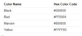
Color Schemes: Most likely you already have theme colors for your company. We suggest documenting specifically what those colors are. You may be thinking, “Blue is blue.” But there are thousands of variations of blue (some of them are even trademarked).
To make things easier as your brand grows, consider using this tool to document just which colors you have used in the past and which ones you’ll be using in the future. This is a tool that allows you to capture the code of the colors you’re using. You can give this code to designers and place it in various web design tools (we’ll get to that in a moment) to create a consistent look for your firm.
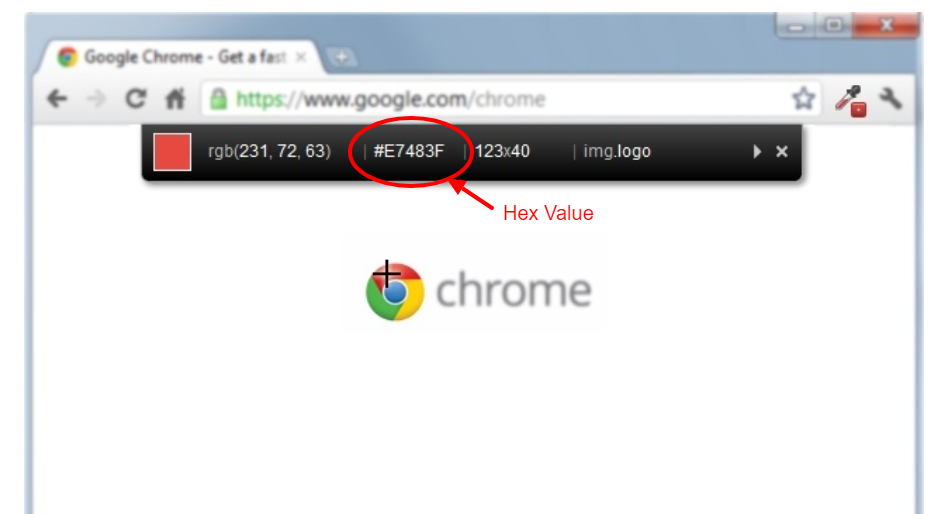
Colorzilla – It’s a chrome extension (but this tool is also available for Firefox) that allows you to mouse over a color on a website. Once you click on the color, the tool gives you a hex code. It’ll look like this:

You can use the hex code when in design tools to ensure you’re using the same color every time your brand shows up online.

Image Selection: You’ll also want to take a moment to standardize the types of images you’ll use in your digital marketing. If you look carefully, you’ll notice some brands never show images of people looking directly at you. Some brands don’t show faces but only hands and the torsos in their imagery. As you begin to explore this world, you’ll begin to see many of these choices are intentional and they convey a unique message about the brand in question.
Now it’s your turn. When you use stock photos to illustrate concepts and ideas in your marketing, what’s the standard? A few suggestions to guide your decision making:
For MSPs and VARs, consider going the simple route of choosing stock images that show professional people using the technology you support such as laptops, mobile phones, tablets, desktops, smart screen, servers/data centers, and more. Here are a few examples:
Where to find images: Keep in mind it’s not a good idea from a licensing and copyright standpoint to conduct a search of Google Images to find stock photos. It’s tempting, but it’s landed many a company in hot (and expensive) water. Instead, consider going with one of the many stock image repositories that have already taken care of licensing for you. Two we love:
Unsplash (Free): This resource is the rare exception in that you can use the free images here without attributing credit to the creator of said images. It’s a nice thing to do, but it’s not required. Here’s a link to their technology images section: https://unsplash.com/search/photos/technology
iStock (Fee-Based): Some of the free image repositories have a limited selection of images, for a wider range of options, you may have to invest a few dollars, but it’s well worth it for consistent and high-level branding. Here’s a link to iStock’s technology-related images: https://www.istockphoto.com/photos/technology?phrase=technology&excludenudity=true&sort=best
We can’t stress enough how much the look and feel of your brand influences how customers and vendors perceive how capable your firm is when delivering solutions.
Logo Placement: Another important part of the brand image discussion is where you’ll allow your logo to show up and how it will show up in relation to images and text on your website and downloadable assets such as infographics, ebooks, and white papers.
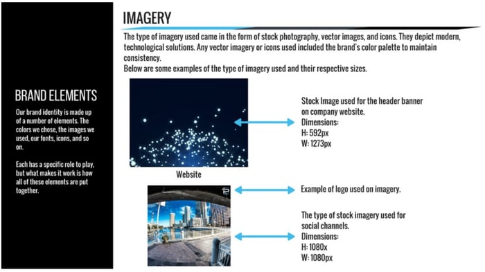
Simply choose where your logo will be placed on images: the upper left corner, upper right corner, lower left corner, lower right corner. Once you make the decision, stick to it. Here’s a look at our logo image placement standard:

3. Document your decisions.
What we just shared here is the beginning of a style guide for your brand. It’s critical in leveraging digital marketing properly for your brand. Create a document that holds all the information about your decisions on fonts, color schemes, and image selection.
This can be a simple Word document listing out your decisions. Or it can be a detailed document similar to one of these style guides.
An Easy-to-Follow Checklist for Digital Marketing Design for MSPs and VARs

We know this can be a lot for busy MSPs and VARs striving to win more business, solidify the move to the MRR business model, while streamlining operations. To make the design portion of your business development efforts easier, we put together this handy checklist.
As you carve out time to nail down how your MSP or VAR brand will look online, consider the following:
- Include white space.
White space is simply blank areas between design elements. Be sure there’s enough space between your text, images, and logos for the casual viewer to easily get an idea of what you’re communicating visually. There’s no real ratio of spacing you should stick to. Just be sure to take a step back before hitting ‘send’ on your marketing materials to consider whether elements of what you’ve created are bunched together or whether they’re evenly spaced and easy to see. Here’s an example:

The image on the left is of one of GoDaddy’s previous websites. The one on the right is a more recent, easier to navigate version.
-
Check image size.
This is specifically important for social media. There are image requirements for how large or small images should be depending on which social media platform you’re using. Handy tools like Canva make this process simple. Here’s a link to a guide that spells out size requirements for social media images.
-
Ensure images match the text.
Sometimes we see companies place images in their marketing materials or on their websites that don’t make the meaning of the text on the page. Be sure you or your team give image selection a bit of thought and match the text and the images so they tell the same story for your brand.
-
Verify links reach the right destination.
One of the most important things to check before publishing a digital marketing campaign is whether links actually go to the location described in the text. This is especially important for links related to gathering lead information such as your Contact Us page or any lead capture locations such as landing pages for content offers
Next Steps in Digital Marketing Design for Busy MSPs and VARs

Keep in mind what we’ve shared are the most important parts of the design portion of your digital marketing efforts. As you can imagine, design is a very detailed and involved world. We spared you the intricate portions of this exercise. But the hidden details still hold importance. The bottom line: It’s important to reach out for help in rolling out a sophisticated, focused branding effort that truly reflects the capabilities of your MSP or VAR business.
The next and most important step in this process is knowing when you’ve done enough to have a basic digital marketing presence and when it’s time to step onto a bigger stage that puts your firm in front of growth-oriented vendors. The vendors have significant MDF budgets, and they’re looking for sophisticated firms they can trust to leverage those dollars in a way that will bring them more business. If you want that to be your company, consider working with a firm with the experience and focus to make that dream reality. Let’s continue the discussion here.